Calming Bedroom Wall Art: How to Choose Pieces That Help You Unwind
The best calming bedroom wall art uses soft, low-contrast colors, a simple composition, and a natural or abstract subject with plenty of empty space — misty landscapes, gentle color fields, a single quiet form. High contrast, busy detail, and hot saturated color all work against sleep, no matter how beautiful the piece.
Bedrooms are where I tell customers to be the most ruthless about editing. The living room can absorb a bold experiment. The last thing you look at before sleep can't. So here's the short version of what I've learned painting for a lot of bedrooms.
What makes a painting feel calming?
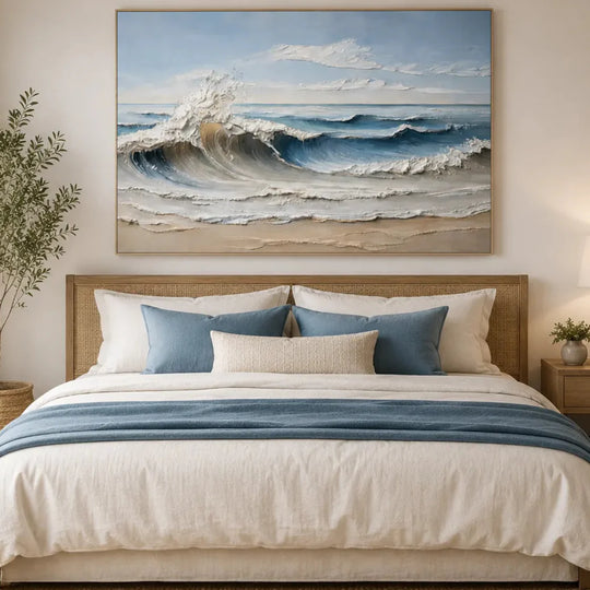
Three things, and they're measurable. Low contrast — the range between the lightest and darkest parts of the painting stays narrow. Simplicity — one subject or one gesture, not twelve. And negative space — empty passages where the eye can rest. That's it. "Calming" isn't a subject matter; it's a set of visual decisions. A stormy seascape painted in six close shades of grey-blue calms a room. A rainbow meadow in full saturation doesn't.
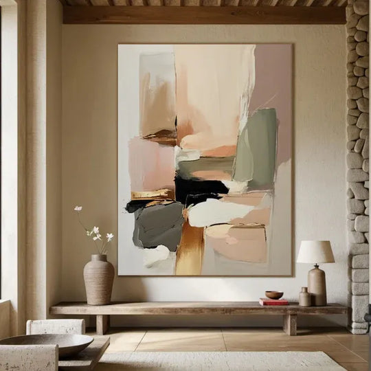
Here's a piece that shows all three decisions at once — a soft glowing form on a cream field, nothing else asking for attention:

On the easel in our studio — a blush minimalist abstract, hand-painted and signed like every piece we ship.
Which colors help a bedroom feel restful?
Muted blues, sage and eucalyptus greens, blush, warm greys, and cream carry decades of color psychology research behind them as the restful end of the spectrum. But the saturation matters more than the hue. A dusty terracotta soothes; a traffic-cone orange never will. If a painting you love runs too hot for the bedroom, that's fixable — we do free color adjustment before painting, so the palette can be tuned down to bedroom volume.
Landscape, abstract, or minimalist — which should you pick?
Whichever you'd rather wake up to, but they quiet a room differently. Landscapes give the eye somewhere to travel — a horizon line is the oldest relaxation device in art. Soft abstracts work when you want mood without a literal scene. Minimalist pieces suit rooms that are already visually busy with textiles and furniture. Watch how much stillness a pale landscape builds from almost nothing:
A white luminous landscape in progress — sun and water, painted by hand. More like it live in our landscape collection.
There's real evidence behind the minimalist route too — we dug into the research in our piece on the psychological benefits of minimalist art.
Where and how should you hang bedroom art?
Above the bed is the natural spot: center the piece over the headboard, bottom edge 15–25 cm above it, and keep the width between half and three-quarters of the bed's width. On the wall opposite the bed, hang at eye level from a lying-down position — lower than you think. One good piece beats three small ones in a bedroom; clutter is the enemy of calm. If standard dimensions don't fit your wall, size customization is free, and every painting arrives with the frame included, photo-approved by you before it ships, with free insured 4–8 day delivery and 30 days to change your mind. Browse what's fresh off the easel in our new arrivals.
FAQ
Is textured art too stimulating for a bedroom? No — texture in a quiet palette adds depth without noise. It reads as calm in daylight and nearly disappears at night.
Should bedroom art match my bedding? Match the room's undertone (warm or cool), not the pattern. Bedding changes; walls shouldn't have to.
What size for above a queen bed? Roughly 80–120 cm wide for a single piece. Wider than the nightstand line starts to feel heavy overhead.
Can art actually improve sleep? Art won't replace good sleep habits, but a low-contrast visual environment measurably reduces stimulation before bed — and what you see last at night sets the tone for how the room feels every day.