How to Choose Abstract & Wabi-Sabi Oil Paintings for Your Home
Choosing wall art can feel overwhelming. But if you’re drawn to spaces that feel natural, calm, and quietly beautiful, abstract and wabi‑sabi oil paintings might be exactly what you need.
This guide covers the essentials—so you can pick a piece that fits your space, your style, and your life.
What Are Abstract and Wabi‑Sabi Art?
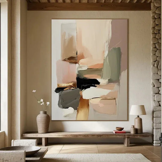
Wabi‑sabi is a Japanese philosophy that finds beauty in imperfection, impermanence, and nature. It shows up in soft, earthy colours, organic shapes, and textures that feel handcrafted rather than machine‑made.
Abstract art shares this spirit—it prioritises emotion, colour, and form over realism. When combined, they create paintings that feel grounded, tactile, and deeply personal.
5 Practical Tips for Choosing Your Painting
1. Look at Your Space First
-
Wall size – A small painting gets lost on a big wall; an oversized piece can overpower a small room.
-
Room function – Bedrooms and lounges suit calm, muted tones; living rooms and entryways can handle more presence and texture.
-
Lighting – Natural light shows true colours; soft accent lighting can highlight brushwork at different times of day.
General rule: Art should cover about two‑thirds to three‑quarters of the wall width (or the furniture it hangs above).
2. Choose Colours That Harmonise
Wabi‑sabi palettes are subtle and earth‑inspired:
-
Soft whites, ash greys, foggy tones
-
Clay browns, ochres, warm creams
-
Muted sage greens, deep umbers
How to match:
-
Echo existing accent colours in your rugs or cushions.
-
For neutral rooms, choose textured pieces with tonal variation for depth.
-
For warm spaces, lean into browns and creams.
The goal is harmony, not perfect matching.
3. Get the Scale Right
-
Large wall → One oversized painting anchors the room.
-
Smaller space → Medium‑scale pieces or a triptych (three panels) add variety without crowding.
-
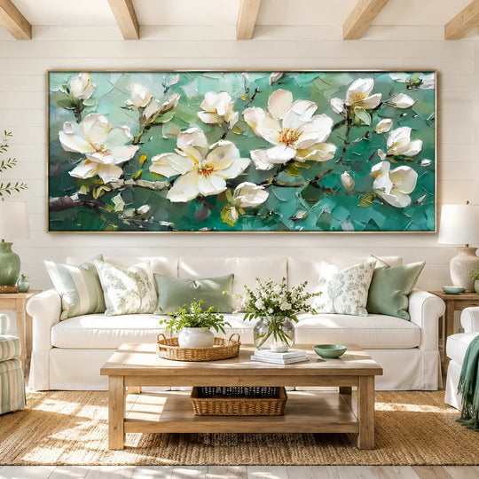
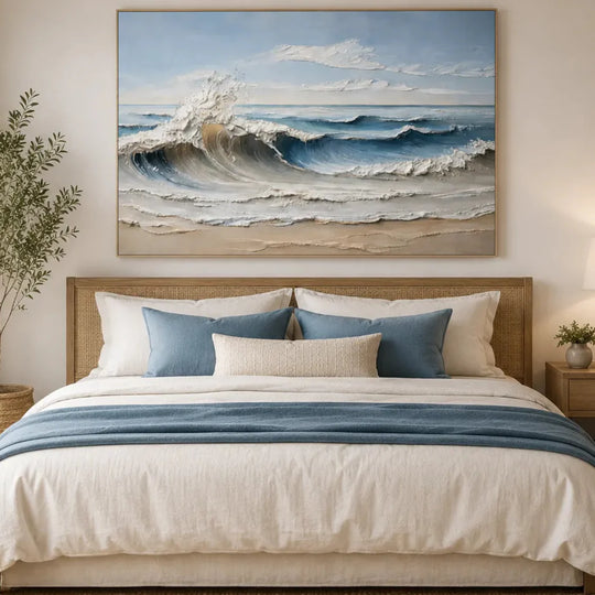
Above furniture → Art should be about ⅔ the width of the sofa or bed.
4. Prioritise Texture and Craftsmanship
This is where hand‑painted oil paintings truly outshine prints.
-
Oil paint has a unique refractive quality—brushstrokes catch light and change throughout the day.
-
Visible texture (impasto, palette‑knife marks) adds depth that flat prints can never replicate.
-
Slight imperfections make each piece one‑of‑a‑kind.
Hand‑painted vs. prints:
-
Texture: physical ridges vs. flat surface
-
Longevity: centuries vs. fading in decades
-
Value: unique heirloom vs. mass‑produced decor
Always choose authentic, hand‑painted work for lasting beauty.
5. Think About the Mood You Want
-
Calm – soft tones, fluid shapes → bedrooms, reading nooks
-
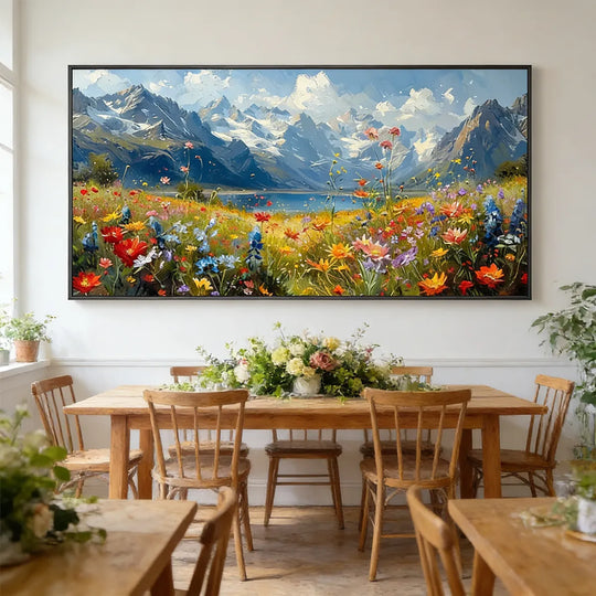
Energy – dynamic movement, contrast → living rooms, entryways
-
Grounding – earthy palettes, visible texture → creates rootedness
Trust your instinct—if a piece moves you, it belongs in your home.
Quick Styling Tips
-
Hang at eye level (centre roughly 145–150 cm from the floor).
-
Consider no frame (raw canvas edges suit wabi‑sabi), or use natural wood frames.
-
Pair with natural materials—rattan, ceramics, dried botanicals, textured walls—for a cohesive look.
Why Hand‑Painted Matters
When you choose hand‑painted oil art, you’re not just buying decor. You’re investing in craftsmanship that will age gracefully, hold its value, and become part of your home’s story.
Ready to find your perfect piece?
Explore our collection of hand‑painted abstract and wabi‑sabi oil paintings—each one unique, crafted with care, and made to bring warmth to your walls.