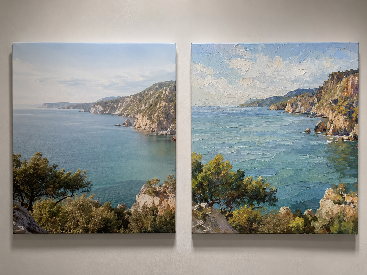
Mid-century interiors never really disappeared. They just evolved. Clean lines, warm neutrals, and functional layouts are still shaping how people design homes today. What often gets overlooked is how much wall art influences whether a space feels authentic or staged.
Mid-century oil paintings sit in a specific position: they are structured enough to match modern architecture, but expressive enough to prevent a room from feeling sterile.
This balance is why they continue to show up in high-end residential design, boutique hotels, and curated interiors.
Why Mid-Century Art Still Works Today
Mid-century design was built around clarity and intention. Nothing excessive, nothing decorative for the sake of decoration.
Oil paintings from or inspired by this era usually share a few traits:
- Controlled abstraction instead of chaotic composition
- Earth-based tones mixed with muted accent colors
- Strong geometric balance or organic asymmetry
- Visible brushwork but not overly aggressive texture
This makes them adaptable. They don’t dominate a room, but they also don’t disappear into it.
The mistake many people make is choosing “generic abstract art” and expecting it to behave the same way. It doesn’t. Mid-century works rely on restraint.
Where These Paintings Work Best in a Home
Placement matters more than style in most cases.
Living room:
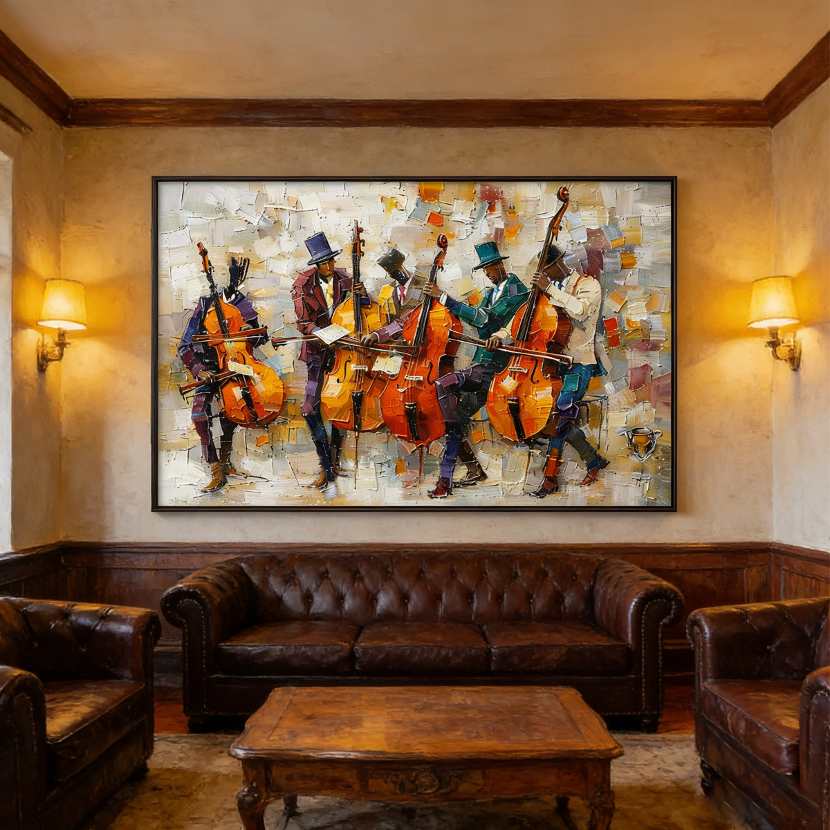
Large horizontal pieces above sofas work best. They anchor seating areas and set the visual tone immediately.
Dining area:
Vertical compositions or paired pieces help guide attention without interrupting conversation flow.
Entryway:
This is where mid-century pieces perform well. First impression spaces benefit from clarity and visual structure.
Bedroom:
Soft abstraction with muted tones prevents overstimulation and supports a calm atmosphere.
Color Strategy: What Actually Works
Mid-century palettes are not random. They are controlled systems.
Common successful combinations include:
- Warm beige + charcoal + muted green
- Off-white + terracotta + black accents
- Sand tones + faded blue + warm gray
What should be avoided is excessive saturation. Bright colors break the cohesion and push the piece into a different design language entirely.
If the goal is a modern luxury interior, tone control matters more than subject matter.
Texture vs Flat Surface: A Practical Choice
One key decision is whether the artwork should be heavily textured or visually flat.
- Textured oil painting: stronger presence, better for large walls and luxury interiors
- Smoother finish: more subtle, better for minimalist Scandinavian spaces
For mid-century-inspired interiors, light-to-medium texture tends to work best. It adds depth without shifting the piece into overly contemporary expressionism.
Why Scale Is Often Misunderstood
Most people buy art that is too small.
Mid-century interiors usually favor proportion over detail. A correctly scaled painting often changes the entire perception of a room more than furniture upgrades do.
A general rule:
- Sofa width = painting should cover 60–75% of it
- Large empty walls = one dominant piece instead of multiple small frames
Undersized art weakens the entire composition of a room, even if the artwork itself is strong.
Choosing the Right Piece for Your Space
Instead of focusing on “style names,” it’s more practical to evaluate three factors:
- Wall size and viewing distance
- Existing material palette (wood, metal, fabric tones)
- Lighting conditions (natural vs artificial dominance)
Mid-century oil paintings work best when they are selected as part of the architecture, not as decoration added afterward.
A More Controlled Approach to Hand-Painted Art
At RosemaryArt, the focus is on hand-painted oil works designed for interior environments rather than standalone visuals.
The key difference is intention: pieces are created with wall scale, framing, and room integration in mind, rather than purely canvas-centric composition.
For mid-century-inspired interiors, this approach matters because inconsistency in proportion or tone breaks the visual discipline the style depends on.
You can explore more options here:
Mid-century inspired wall art collection
Final Thought
Mid-century oil paintings are not about nostalgia. They are about control—of color, composition, and space.
When selected correctly, they don’t “decorate” a room. They stabilize it.
If a space feels visually unresolved, the problem is often not furniture or layout. It’s usually the absence of a central visual anchor that understands proportion and restraint.
That is exactly where this category of artwork still performs better than most modern alternatives.