How to Choose Wabi Sabi Wall Art for a Calm, Textured Home
 A calm home does not always need more decoration. Often, it needs fewer pieces with better feeling. That is why wabi sabi wall art works so well in modern interiors. It brings texture, softness, and quiet beauty without making the room feel crowded.
Imagine a living room with a linen sofa, warm wood flooring, a stone coffee table, and soft natural light. The wall does not need something loud. It needs something grounded. Something that feels handmade. Something with depth.
That is where wabi sabi art becomes useful.
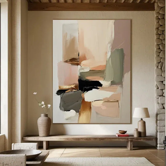
Wabi sabi is about natural imperfection, quiet texture, and beauty that feels lived-in rather than polished. In wall art, this usually means muted colors, organic shapes, raised surfaces, soft brushwork, and a sense of restraint. It is not empty. It is not plain. It is calm.
For homeowners, this kind of artwork can make a bedroom, living room, or dining room feel warmer and more personal. For interior designers and hotel project buyers, it can add atmosphere without taking over the whole space.
The key is choosing the right piece. Not every beige artwork is wabi sabi. Not every textured painting will suit a quiet home. The best choice depends on texture, color, scale, material, frame, and the mood you want the room to hold.
Why Wabi Sabi Wall Art Feels So Natural at Home
Wabi sabi wall art works because it does not try too hard.
Many modern homes already have clean lines, smooth walls, large windows, and simple furniture. These spaces can look beautiful, but sometimes they feel a little cold. A textured artwork adds the missing layer.
It gives the wall a surface you can feel, even from across the room.
Unlike glossy prints or sharp graphic posters, wabi sabi art has a slower presence. It catches light gently. It creates small shadows. It makes the room feel more human.
That matters because home is not a showroom. A good room should breathe. It should feel comfortable in the morning, peaceful at night, and still beautiful when nothing special is happening.
Wabi sabi wall art supports that kind of feeling.
It works especially well with:
- Linen sofas
- Wood furniture
- Stone tables
- Neutral rugs
- Clay, ceramic, or plaster decor
- Soft warm lighting
- Minimal or Japandi interiors
- Organic modern homes
- Boutique hotel rooms
- Quiet luxury spaces
The style feels refined, but not stiff. It gives a room texture without noise.
What Wabi Sabi Really Means in Wall Art
Wabi sabi is often misunderstood. Some people think it only means old, rough, or unfinished. That is too simple.
In interior design, wabi sabi is more about accepting natural beauty. It favors things that feel honest, imperfect, soft, and time-worn. It does not chase a perfect glossy surface. It values small marks, uneven texture, organic form, and quiet balance.
In wall art, this can appear through:
- Hand-painted texture
- Irregular lines
- Soft neutral colors
- Minimal abstract shapes
- Matte surfaces
- Layered brushwork
- Plaster-like effects
- Earth-inspired tones
The goal is not to make the wall look empty. The goal is to make it feel calm and considered.
A good wabi sabi painting should have presence, but it should not shout. It should look natural with the room, as if it belongs there.
Here is a simple comparison:
| Type of Wall Decor | Main Feeling | Best Use |
|---|---|---|
| Flat neutral print | Clean and simple | Budget styling or temporary decor |
| Standard abstract canvas | Decorative and flexible | General home decoration |
| Textured wabi sabi painting | Soft, tactile, organic | Calm homes, bedrooms, living rooms |
| Hand-painted wabi sabi oil painting | Rich, personal, high-end | Homes, hotels, designer projects, long-term interiors |
The difference is not only visual. It is emotional.
A flat print can fill a blank wall. A hand-painted textured painting can change the way the room feels.
 How to Choose Wabi Sabi Wall Art by Texture
Texture is the heart of wabi sabi wall art.
Color matters, of course. But texture is what gives the piece life. A beige print and a beige textured oil painting may look similar in a small image online. In a real room, they feel very different.
A textured painting reacts to light. During the day, the raised surface may look soft and pale. At night, under warm lamps, the texture may look deeper and more sculptural.
That is why texture should be your first decision.
Ask yourself: how much surface depth does the room need?
If your space already has many tactile materials — boucle chairs, linen curtains, wood beams, stone floors — choose a softer texture. The artwork should not compete with everything else.
If your room feels too smooth or flat, choose stronger texture. A 3D textured oil painting can make the wall feel more complete.
Common texture styles include:
| Texture Style | Feeling | Best Room Type |
| Fine brushed texture | Soft and quiet | Bedroom, reading corner, hallway |
| Plaster-like texture | Natural and earthy | Living room, dining room |
| Heavy raised texture | Sculptural and bold | Large wall, hotel lobby, feature wall |
| Minimal line texture | Clean and architectural | Entryway, office, modern home |
| Layered organic texture | Warm and handmade | Japandi or organic modern space |
Here is the mistake many buyers make: they choose only by color.
They see a beige painting and assume it will work. But if the surface is too flat, the room may still feel unfinished. If the texture is too heavy, the wall may feel visually crowded.
The right texture should match the quiet level of the room.
Choosing the Right Color Palette
Wabi sabi color is usually soft, natural, and easy to live with. It does not need to be boring. It simply needs to feel grounded.
The best colors often come from nature: stone, sand, clay, linen, paper, wood, ash, and warm earth.
Good choices include:
- Warm white
- Ivory
- Cream
- Beige
- Sand
- Taupe
- Clay
- Greige
- Warm gray
- Soft black
- Muted brown
- Light ochre
These colors work because they do not age quickly. A calm neutral painting can stay in your home for years without feeling tied to one short trend.
For a bedroom, choose ivory, warm white, soft beige, or pale taupe. These colors help the room feel restful.
For a living room, you can use sand, clay, greige, or warm gray. These tones add more depth while staying calm.
For a dining room, a darker beige, muted brown, or cream-and-black abstract piece can feel more grounded.
For a hotel or commercial space, use stronger contrast carefully. Large spaces may need more presence, but the artwork should still feel refined.
A useful rule: connect the artwork to at least two materials already in the room.
For example:
- Ivory artwork + linen sofa + light oak floor
- Clay-toned painting + terracotta decor + walnut furniture
- Cream-and-black painting + black lighting + stone table
- Beige textured art + jute rug + warm white walls
This makes the artwork feel intentional, not random.
How to Choose the Right Size
Size can make or break the whole wall.
A beautiful wabi sabi painting that is too small will look weak. A piece that is too large may feel heavy, especially in a calm room.
The artwork should feel connected to the furniture and the wall around it.
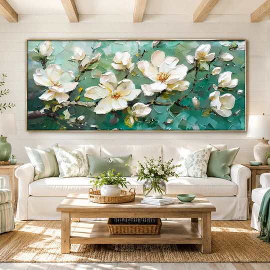
For artwork above a sofa, choose a width around two-thirds to three-quarters of the sofa width. This creates balance without making the painting look oversized.
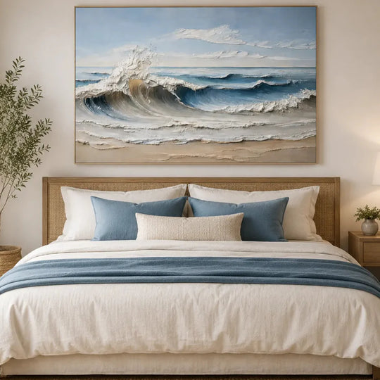
For artwork above a bed, the piece should usually be wider than the headboard’s center area but not wider than the bed frame. A large horizontal painting often works well here.
For an entryway, a vertical piece can create a quiet first impression.
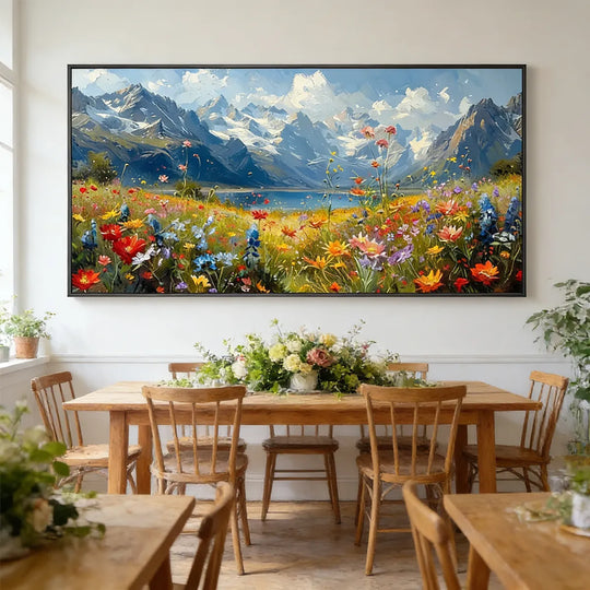
For a dining room, one large textured painting can be better than several small pieces. It gives the room a stronger focal point and keeps the mood clean.
For hotel rooms or commercial projects, custom sizing is often the better choice. Standard artwork may not fit the wall, headboard, corridor, or lobby proportion properly.
A quick sizing guide:
| Space | Recommended Direction |
| Bedroom | Medium to large horizontal art |
| Living room | Large wall art above sofa |
| Dining room | One calm statement piece |
| Entryway | Vertical or square textured painting |
| Office | Minimal textured abstract art |
| Hotel room | Custom size based on wall plan |
| Lobby or corridor | Large or repeated custom pieces |
Do not choose size only by wall width. Also consider ceiling height, furniture height, and viewing distance.
A tall wall may need a larger vertical proportion. A narrow wall may need a slim piece. A wide sofa may need one large painting or a diptych.
The goal is not to fill every inch. The goal is to create balance.
Why Hand-Painted Wabi Sabi Art Feels Different
A hand-painted wabi sabi oil painting has a different kind of presence.
You can see the brushwork. You can see the raised surface. You can see small variations that come from the artist’s hand. These details are not defects. They are part of the beauty.
This is especially important for wabi sabi style because the whole mood depends on natural imperfection.
A printed image may copy the look of texture, but it cannot create real raised paint. A hand-painted textured oil painting gives the room actual surface depth.
That depth matters in high-end interiors.
It makes the artwork feel less like decoration and more like part of the space.
A handmade painting can also be adjusted more easily. Size, color, texture strength, frame style, and layout can be changed to suit the room. This is useful for homeowners who want a more personal piece, and even more useful for designers working on full-room concepts.
A good hand-painted piece does not need to be visually loud. In fact, the most refined wabi sabi paintings are often quiet. Their value is in the surface, proportion, and mood.
You can explore Rosemary Art’s <u>Wabi-Sabi Wall Art Collection</u> to see textured, organic, and minimalist pieces made for calm interiors.
How to Match Wabi Sabi Wall Art With Different Rooms
Each room has a different emotional job. Your artwork should support that job.
A bedroom should feel restful. Choose soft colors, gentle texture, and low contrast. Avoid pieces that feel too busy above the bed.
A living room can hold more presence. This is often the best place for large wall art. Choose a piece that connects with the sofa, rug, coffee table, and lighting.
A dining room benefits from warmth. A clay, sand, taupe, or cream textured painting can make the space feel slower and more intimate.
An entryway should feel simple but memorable. A vertical wabi sabi painting can set the mood for the whole home.
A hallway needs rhythm. Smaller textured works or a long horizontal piece can guide the eye without making the space feel narrow.
A hotel room needs calm, durability, and broad appeal. The artwork should feel special but not too personal. Neutral textured paintings work well because they suit many guests and many furniture palettes.
A commercial space may need stronger visual structure. In this case, custom large wall art can help create a polished design without using loud color.
The best question is simple: what should this room feel like?
Restful? Warm? Grounded? Minimal? More natural? More premium?
Choose the artwork after you answer that.
Frame Choice Matters More Than People Think
The frame can change the whole feeling of wabi sabi wall art.
A black floating frame adds structure. It works well in modern homes, offices, dining rooms, and spaces with black lighting or metal accents.
A natural wood frame feels warmer and softer. It suits Japandi interiors, organic modern rooms, and homes with oak, walnut, or rattan details.
A gold frame can work, but it must be used carefully. Too much shine may fight against the quiet mood of wabi sabi. If you choose gold, keep it muted or brushed rather than bright.
An unframed canvas can feel relaxed and simple, but it may not suit every high-end room. For hotel projects, designer interiors, or formal living rooms, a floating frame often gives the painting a more finished look.
Frame depth also matters. A deep frame can make textured art feel more substantial. A slim frame keeps the look light.
The frame should not steal attention from the surface. It should support it.
Why Custom Wabi Sabi Wall Art Is Useful for Designers and Project Buyers
Custom wabi sabi wall art is not only about personal taste. It is about solving real design problems.
Interior designers often need artwork that fits a specific wall, color palette, furniture plan, or project mood. Hotel buyers may need several pieces that feel related but not identical. Homeowners may want one special piece that fits a large wall properly.
Custom hand-painted art can help with all of that.
You can adjust:
- Size
- Color palette
- Texture level
- Shape direction
- Canvas orientation
- Frame color
- Frame depth
- Diptych or triptych layout
- Overall mood
This is especially useful when the room already has strong materials. For example, if a hotel suite has walnut panels and cream bedding, the artwork can be painted with warm beige, ivory, and soft brown tones. If a living room has black lighting and stone decor, the painting can include subtle black linework.
Custom art helps the room feel planned.
It also reduces one common risk: buying art that looks good by itself but does not belong in the space.
If you are planning a calm bedroom, living room, hotel suite, or designer project, Rosemary Art’s <u>Wabi-Sabi Wall Art Collection</u> is a useful place to compare texture, tone, size, and overall mood.
What to Check Before Buying Wabi Sabi Wall Art
Before you choose a piece, slow down and check the room.
A calm artwork still needs practical fit.
Start with the wall. Measure the width and height. Then measure the furniture below it. Look at the distance from the floor, ceiling, sofa, bed, or console.
Next, check the light. Does the wall get direct sun? Is the room mostly lit by warm lamps? Does the artwork need stronger texture to show up?
Then look at materials. Is the room full of wood? Stone? Linen? Leather? Metal? The painting should connect with these elements.
Also consider how close people will stand to the artwork. In a hallway or bedroom, people may view it close up. Fine texture matters there. In a lobby or dining room, people may see it from farther away. A stronger composition may work better.
Before buying, ask:
- Does the size suit the wall and furniture?
- Does the texture feel too soft, too heavy, or just right?
- Does the color connect with the room?
- Does the frame match the interior style?
- Will the artwork still feel good at night?
- Does the piece support the mood of the room?
That last question is the most important.
Art should not only match the room. It should improve the room.
Final Thoughts
Wabi sabi wall art is a strong choice when you want a calm, textured home that feels warm instead of empty.
It brings softness to modern rooms, depth to neutral palettes, and personality to simple walls. The best piece does not need bright color or dramatic detail. It needs the right texture, the right scale, and the right feeling.
For a bedroom, choose quiet tones and gentle texture. For a living room, consider large wall art with more surface depth. For hotels and designer projects, custom sizing and color adjustment can make the artwork fit the space more naturally.
Most of all, choose a piece that makes the room feel settled.
A calm home does not come from filling every wall. It comes from choosing the right few pieces — the ones that make the space feel complete.
FAQ
1. What is wabi sabi wall art?
Wabi sabi wall art is artwork inspired by natural imperfection, quiet texture, and simple beauty. It often uses neutral colors, organic shapes, matte surfaces, and hand-painted details to create a calm and grounded feeling in the home.
2. Is wabi sabi wall art good for a bedroom?
Yes. Wabi sabi wall art is a good choice for bedrooms because it feels soft, quiet, and restful. For a calm bedroom, choose beige, ivory, taupe, or warm gray textured wall art with gentle surface movement.
3. What size wabi sabi wall art should I choose above a sofa?
For wabi sabi wall art above a sofa, choose a piece that is about two-thirds to three-quarters of the sofa width. This helps the artwork feel balanced with the furniture and keeps large wall art from looking too small or too heavy.
4. Is hand-painted wabi sabi art better than a print?
Hand-painted wabi sabi art usually feels richer than a print because it has real brushwork, raised texture, and surface depth. A print can show an image of texture, but a textured oil painting creates actual light and shadow on the wall.
5. Can I order custom wabi sabi wall art for a hotel or interior design project?
Yes. Custom wabi sabi wall art is useful for hotels, interior designers, and commercial spaces because the size, color, texture level, and frame can be adjusted to match the project. This helps the artwork feel planned rather than added later.
Continue exploring: Browse our Wabi-Sabi Art collection, see this week's new arrivals, or shop our best sellers — every piece 100% hand-painted, frame included.