What Color Wall Art Goes With Beige or Neutral Walls?
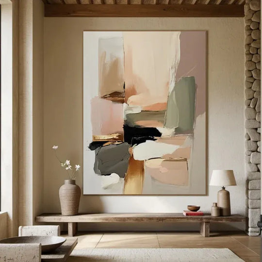
The easiest, most designer-approved choice for beige or neutral walls is art that lives in the same warm family creams, taupe, oatmeal, soft brown with one quiet contrast note like muted blue, sage, or charcoal. On a neutral wall you want texture and tone to do the work, not a shouting color. That's the short answer. Here's how to actually pull it off.
Beige gets unfairly called boring. It isn't. It's the hardest wall color to decorate well, because there's no bold backdrop to hide behind. Get the art right and the whole room reads calm and expensive. Get it wrong and it reads like a waiting room.
Should the art match the wall or contrast with it?
Both, in the right amounts. The trick most people miss is tonal contrast, not color contrast. Put a cream-and-taupe painting on a beige wall and let the difference come from light and dark values plus real surface texture. The piece won't disappear, because raised plaster-like ridges throw their own little shadows. This is exactly why wabi-sabi art works so well in neutral rooms it's built on subtle tonal shifts and imperfect texture rather than color pop.
What colors actually look good on a beige or greige wall?
A few combinations I reach for again and again:
- Tone-on-tone neutrals. Cream, sand, and warm white in one textured abstract. Quiet, layered, never flat.
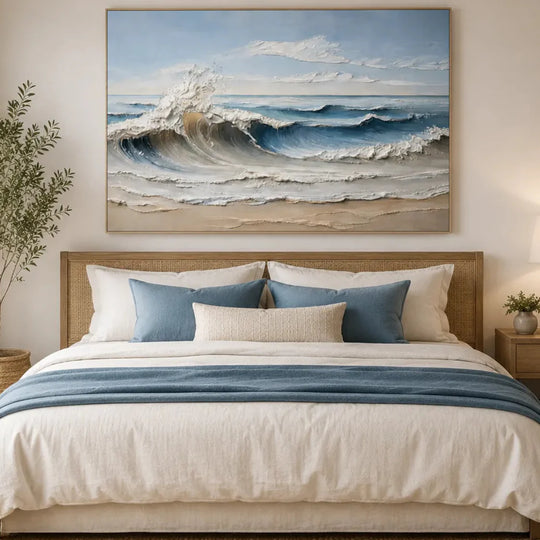
- Beige plus one cool note. A dusty blue, a soft sage, or a slate gray keeps warm walls from feeling one-note. Think seascape blues against sand.
- Warm metallics and charcoal. A little gold, bronze, or deep charcoal adds definition without fighting the wall.
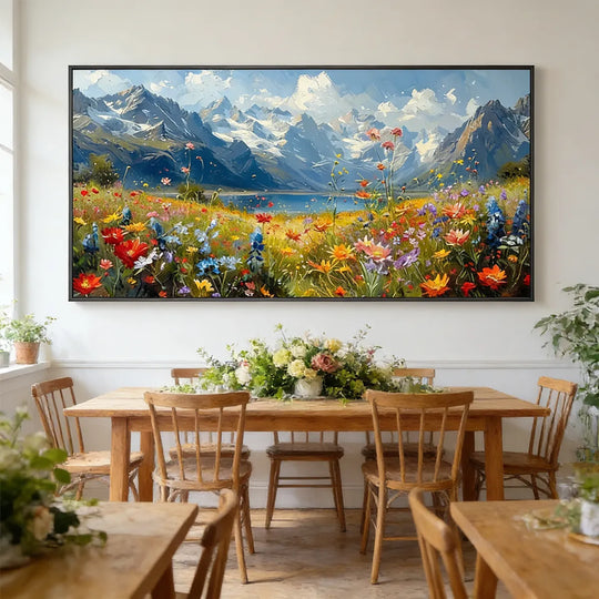
What to avoid: pure stark white (it can look like a blank spot), and high-saturation primaries that turn beige muddy by comparison.
Does undertone matter?
More than color, honestly. Beige runs pink, yellow, or gray underneath, and your art should nod to the same undertone. A yellow-beige wall loves warm creams and gold; a gray-beige (greige) wall handles cooler blues and charcoal beautifully. Hold a swatch or a sample photo against the wall in daylight before you commit. If matching undertones sounds fussy, it's the one place a little patience pays off and it's also where our free color customization helps. Tell us your wall's undertone and we'll mix the palette to sit right, instead of you hoping a stock piece happens to work.
If you want the science behind why some pairings feel harmonious, the basics of color theory explain a lot in a few paragraphs.
How does this compare to choosing art for furniture?
Same logic, different anchor. When you pick art for a wall, you're matching a large flat field; when you pick it for a couch, you're matching a smaller, closer object. If your sofa is the thing driving the room, our guide on what color wall art goes with a gray sofa uses the same tonal approach for a different starting point.
Texture is the secret weapon on neutral walls
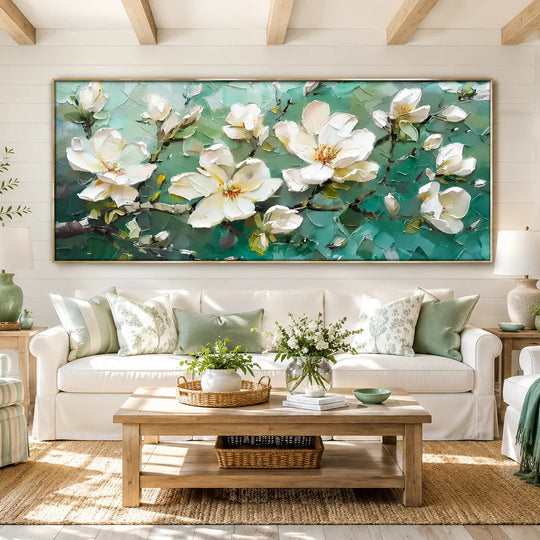
Here's the part flat prints can't fake. On a beige wall, a smooth printed poster tends to sink in and vanish. A hand-painted, physically textured canvas catches side light and comes alive as the day moves. That tactile quality is the whole reason 3D texture became the defining home-art trend of 2026 in a feed full of AI-generated images, a surface you can actually see peaks and valleys on feels real. Browse the 3D textured collection to see what I mean, or the broader abstract range for softer options.
Every piece is 100% hand-painted and signed, the frame is included, and we photograph your finished painting for approval before it ships free, insured delivery usually runs 4–8 days, with 30-day returns if the tone isn't right in your light.
FAQ
What is the safest art color for beige walls? Warm neutrals in the same family cream, taupe, soft brown with one muted contrast like blue or charcoal.
Does black-and-white art work on beige? Yes, especially with warm-toned frames, but soften pure white with cream so it doesn't read as a gap.
Should art match my beige undertone? Yes. Warm (yellow/pink) beige loves warm creams; gray-beige handles cooler blues and grays.
One big piece or a set? On a large neutral wall, one textured statement piece usually beats a scattered gallery it keeps the calm.
Beige isn't a limitation. It's a clean stage. Give it tone, undertone, and real texture, and neutral walls stop being safe and start being serene.