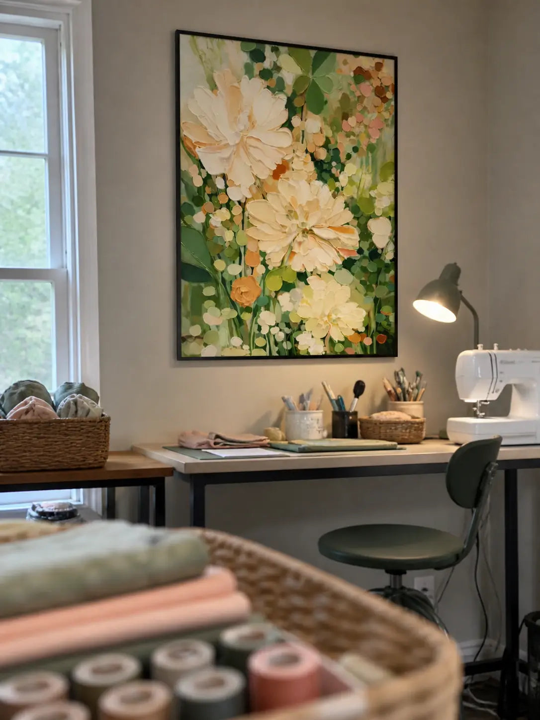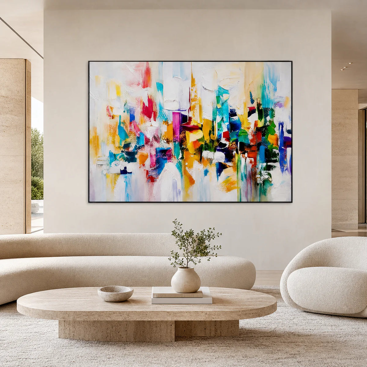
A room can be fully furnished and still feel unfinished. The sofa may fit, the rug may coordinate with the curtains, and the lighting may be carefully planned—but without the right artwork, the space can lack personality and visual focus.
Choosing art for a home is not simply about finding a painting that matches the wall color. A well-selected artwork should connect with the proportions, materials, mood, and architecture of the room.
This guide explains how to choose art for your home using the same practical considerations that interior designers use: scale, color, composition, texture, placement, and emotional connection.
1. Start With the Feeling You Want to Create
Before choosing a color or measuring the wall, decide how you want the room to feel.
Art can introduce calm, movement, warmth, contrast, or drama. The right emotional direction depends on how the space is used.
| Room | Desired Feeling | Suitable Art Direction |
|---|---|---|
| Living room | Welcoming and balanced | Large abstract or textured artwork |
| Bedroom | Calm and restful | Soft colors and simple compositions |
| Dining room | Warm and social | Expressive colors or organic forms |
| Entryway | Memorable and distinctive | Bold vertical or statement art |
| Home office | Focused and structured | Geometric or restrained abstract art |
| Meditation space | Quiet and natural | Neutral, organic, or wabi-sabi artwork |
Do not begin by asking, “What color matches my sofa?” Start by asking, “What should this room feel like?”
That question produces a more intentional result.
2. Choose Art That Relates to the Interior Style
Artwork does not need to follow the interior style exactly, but it should have a clear relationship with the space.
A modern room can support traditional artwork when the colors or proportions are carefully controlled. Likewise, a neutral interior can benefit from one expressive painting that prevents the room from feeling too predictable.
| Interior Style | Recommended Artwork |
| Modern | Abstract forms, clean compositions, bold scale |
| Minimalist | Neutral colors, restrained texture, simple shapes |
| Contemporary | Large statement paintings and mixed textures |
| Organic modern | Earth tones, soft curves, natural-looking surfaces |
| Wabi-sabi | Uneven texture, muted colors, imperfect forms |
| Industrial | Black, grey, rust, structured lines |
| Coastal | Soft blue, white, sand, fluid compositions |
| Luxury interior | Oversized hand-painted art with refined framing |
For modern interiors, explore hand-painted abstract art with different colors, proportions, and levels of texture.
3. Get the Artwork Size Right
Choosing artwork that is too small is one of the most common decorating mistakes.
A small painting placed above a large sofa often looks disconnected from the furniture. Instead of completing the room, it emphasizes how empty the wall is.
As a practical starting point, artwork placed above furniture should usually occupy around 60% to 75% of the furniture width. RosemaryArt uses the same general sizing guidance across its living-room and abstract-art collections.
Wall Art Size Guide
| Furniture or Wall Width | Suggested Artwork Width |
| 60–70 inches | 36–50 inches |
| 70–85 inches | 45–60 inches |
| 85–100 inches | 55–75 inches |
| 100–120 inches | 65–90 inches |
| Large empty wall | One oversized piece or a coordinated set |
These are starting points rather than fixed rules. Architectural features, ceiling height, furniture placement, and viewing distance should also influence the final choice.
Single Artwork or Multiple Pieces?
Choose one large artwork when:
- The room already contains several decorative objects.
- You want a strong focal point.
- The wall is positioned above a sofa, bed, or console.
- The artwork has visible texture or detailed brushwork.
Choose a diptych or triptych when:
- The wall is unusually wide.
- You want more rhythm and movement.
- A single canvas would be difficult to transport.
- The room has repeated architectural elements.
When standard sizes do not suit the wall, custom hand-painted artwork can be adjusted by size, color, texture, orientation, and frame. RosemaryArt’s custom service also includes a tailored proposal and room mock-up before production.
4. Match Color Without Matching Everything
Artwork should connect with the room, but it does not need to repeat every existing color.
When the painting, sofa, rug, cushions, and curtains all use exactly the same tone, the room can feel overly coordinated and visually flat.
A more professional method is to use three color roles:
- Dominant color: the main neutral or background color in the room.
- Supporting color: a color already present in furniture, textiles, or accessories.
- Accent color: a contrasting tone that adds focus or energy.
Simple Color-Matching Examples
| Room Palette | Artwork Direction |
| Beige and natural wood | Ivory, sand, clay, muted black |
| Black and white | Monochrome art with warm grey or brown |
| Blue and grey | Deep blue, white, silver, or soft beige |
| Cream and gold | Warm neutral art with restrained metallic accents |
| Green and brown | Olive, stone, cream, charcoal |
| Terracotta and beige | Rust, warm white, brown, muted blue |
Color is one of the fundamental visual elements artists use to create harmony, contrast, movement, and mood. The National Gallery of Art also identifies color, line, shape, form, and texture as core elements for understanding how artwork functions visually.
5. Consider Texture and Lighting
Texture becomes especially important in rooms with a restrained color palette.
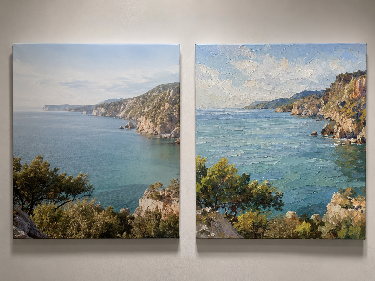
A beige or white painting may look simple from a distance, but raised brushstrokes, palette-knife marks, and layered materials can create depth when viewed under natural or directional lighting.
| Texture Level | Best Application |
| Light texture | Bedrooms and small, quiet rooms |
| Medium texture | Living rooms, dining rooms, and offices |
| Heavy texture | Large feature walls and open-plan spaces |
| Sculptural texture | Hotel, commercial, or statement interiors |
Lighting can change the appearance of textured art throughout the day. Side lighting creates stronger shadows, while direct frontal lighting can make the surface appear flatter.
Before purchasing, examine:
- Close-up photographs of the surface
- Side-angle images showing the depth
- Daylight and evening images
- Videos showing the artwork from different positions
- Whether the texture is hand-applied or digitally simulated
You can browse 3D textured paintings when a room needs more physical depth and visual movement.
6. Choose Art for the Furniture, Not Just the Wall
Artwork should form a visual group with the furniture beneath it.
Above a sofa, bed, or console, the painting should feel connected to the object below rather than floating near the ceiling.
A useful process is:
- Mark the proposed artwork dimensions on the wall with removable tape.
- View the outline from across the room.
- Check it while standing and sitting.
- Photograph the wall to compare different sizes.
- Confirm that the artwork does not compete with nearby windows, shelves, or lighting.
Architectural Digest recommends evaluating placement from a distance and having another person hold the artwork while you judge the position. This is more reliable than choosing the height while standing directly beside the wall.
For spaces above a sofa or main seating area, browse the living room art collection.
7. Decide Whether the Artwork Should Blend In or Stand Out
There are two valid approaches.
The Harmonious Approach
Choose artwork that repeats the room’s existing colors, materials, and shapes.
This works well for:
- Bedrooms
- Minimalist interiors
- Neutral living rooms
- Spa-like spaces
- Wabi-sabi homes
The Contrast Approach
Choose artwork that introduces a stronger color, scale, or composition.
This works well for:
- Large blank walls
- Simple modern rooms
- Entryways
- Dining rooms
- Interiors dominated by neutral furniture
The mistake is not choosing contrast or harmony. The mistake is creating accidental contrast—a painting that is too small, too bright, or stylistically disconnected without a clear reason.
8. Understand Hand-Painted Art, Prints, and Original Art
These terms should not be treated as interchangeable.
| Type | Description | Best For |
| Original one-of-a-kind art | A unique work that is not reproduced | Collectors seeking exclusivity |
| Hand-painted art | Individually painted by an artist, sometimes based on an existing design | Buyers seeking real brushwork and customization |
| Limited-edition print | A numbered reproduction with a restricted quantity | Collectors with a controlled budget |
| Open-edition print | A mass-produced reproduction | Affordable general decoration |
| Textured print | A printed image with an added surface coating | Budget-focused dimensional decor |
A hand-painted work can still contain individual variations in brushwork, color, and texture, even when the artist recreates an existing composition. However, it should not automatically be described as a one-of-a-kind original unless only one version exists.
When shopping online, read the product description carefully and verify whether the work is painted by hand, printed, hand-embellished, or fully unique.
9. Choose a Frame That Supports the Artwork
A frame should finish the presentation without competing with the painting.
| Frame Option | Suitable Interior |
| Black floating frame | Modern, industrial, monochrome |
| Gold floating frame | Luxury, warm contemporary, hotel-style |
| Natural wood frame | Organic modern, Scandinavian, coastal |
| White frame | Light minimalist interiors |
| Unframed gallery wrap | Clean contemporary spaces |
Floating frames work particularly well with hand-painted and textured canvas because the narrow gap around the artwork preserves the visibility of the painted edges.
RosemaryArt provides framed, stretched-canvas, and rolled-canvas options depending on the artwork and installation requirements. More details are available in the frame options guide.
10. Buy Art You Can Live With
Trends can help you discover styles, but they should not make the final decision.
Artwork occupies a visible place in your home and may remain there for many years. Choose a piece that holds your attention beyond the first impression.
Vogue’s art-buying guidance similarly focuses on selecting work that can remain meaningful in a home over the long term, rather than treating art as a temporary decorative accessory.
Before buying, ask:
- Would I still enjoy this painting if I changed the cushions or rug?
- Does it create the atmosphere I want?
- Is the scale strong enough for the wall?
- Can I see evidence of the materials and workmanship?
- Is the artwork framed appropriately?
- Can the size or color be customized?
- Will I receive final images before shipment?
- Do I understand the delivery and return terms?
Frequently Asked Questions
Should wall art match the sofa?
It should relate to the sofa, but it does not need to match it exactly. Repeating one or two colors is usually enough. Contrast can make the artwork more visible and prevent the room from feeling overly coordinated.
How large should art be above a sofa?
A practical starting point is approximately 60% to 75% of the sofa width. The final size should also account for wall width, ceiling height, nearby furniture, and viewing distance.
Should every room use the same art style?
No. Different rooms can support different moods. Consistency can come from repeated colors, frame finishes, or materials rather than identical artwork.
Is hand-painted art better than a print?
Neither is automatically better for every buyer. Hand-painted art provides physical brushwork, surface variation, and greater customization. Prints are generally more affordable and easier to reproduce.
Can artwork be customized to match a room?
Yes. Custom artwork may be adjusted by size, color, orientation, texture, and frame. A room mock-up can also help confirm the proportions before production begins.
Final Thoughts
Learning how to choose art for your home is less about following rigid decorating rules and more about making deliberate decisions.
Start with the atmosphere you want to create. Measure the wall and furniture before selecting a size. Connect the artwork to the room through color, texture, or composition—but avoid matching every detail. Finally, choose a piece that still feels meaningful after the surrounding décor changes.
When scale, placement, color, and personal connection work together, artwork stops looking like an accessory. It becomes part of the architecture and identity of the home.