What Art Goes With Beige and Neutral Walls? A Painter's Answer
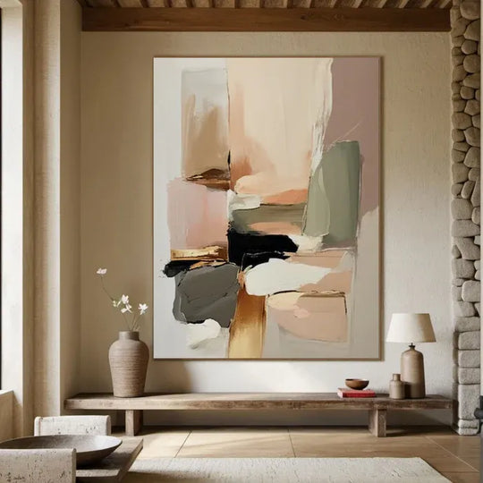
The best art for beige and neutral walls isn't a burst of color — it's texture in the same family of tones: cream, sand, bone, warm white, with the interest coming from relief and shadow instead of pigment. Tone-on-tone with real texture reads as calm and expensive; a random bright print reads as a dorm room.
That's an opinion, and I'll defend it. We paint a lot of work for neutral rooms, and the requests follow a pattern: people with beige walls are afraid their room is boring, so they reach for the loudest painting they can find. Then it arrives, and it fights the room. The rooms that end up photographed for house tours almost always went the other way.
Why does tone-on-tone work so well on beige?
Because beige isn't one color — it's a family. Greige, oatmeal, mushroom, sand. A painting that stays inside that family but adds physical texture gives the eye something to do without breaking the room's temperature. Light moves across the ridges during the day, so the painting looks different at 9am than at dusk. Flat prints can't do that, which is one reason textured originals took off as the counter-trend to the flood of AI-generated flat images — 2026's texture obsession is largely a reaction to screens full of perfect fakes.

Beige on beige, and nowhere near boring — the scratch lines and plaster-like relief do the talking.
Should you add a contrast color at all?
You can — but make it earned, not random. One accent that already exists somewhere in the room (a brass lamp, a walnut table, olive cushions) can echo in the painting: a thread of gold, a shadow of green, a charcoal line. What I'd avoid is primary colors with no relatives in the room. If your sofa is gray rather than beige, the logic changes slightly — we covered that in what color wall art goes with a gray sofa.
Which styles suit neutral rooms best?
Three reliably work. Wabi-sabi abstracts — imperfect, quiet, plaster-textured — are practically made for beige walls; the whole aesthetic is built on natural materials and muted tones (the wabi-sabi philosophy is worth reading about even if you never buy a painting). Minimalist landscapes — a lone tree, a pale horizon — add a subject without adding noise. And sculptural 3D-textured abstracts turn the wall itself into the feature. You'll find all three in our wabi-sabi collection and 3D textured paintings.
What size should you go?
Bigger than you think. Neutral rooms forgive scale generously — a large tone-on-tone piece can't overwhelm the way a large colorful one can. Above a sofa, aim for two-thirds of the sofa's width. On an empty feature wall, fill 60–75% of the visual field at eye level. And if the standard sizes don't fit your wall, that's a solvable problem: we do free size and color customization, so the painting is made for your wall rather than squeezed onto it.
FAQ
What color art goes with beige walls? Stay in the neutral family — cream, sand, warm white, soft gray — and let texture carry the interest. Add at most one accent color that already exists in the room.
Is beige-on-beige art boring? Only if it's flat. A textured original changes with the light all day; that movement is what a print can't replicate.
Does black art work on beige walls? Yes, as deliberate contrast — a charcoal or black-and-white piece can anchor a pale room, but commit to it as the focal point.
How do I know the texture is real? Every painting we ship is 100% hand-painted and signed, the frame's included, and we send you photos of your exact piece for approval before it ships — free insured delivery in 4–8 days, 30-day returns if it's not right.
If your walls are beige and your nerve is holding, start with the wabi-sabi pieces. Trust the quiet ones.