Introduction
Each year, Pantone’s Color of the Year influences global design trends—from fashion to interiors. In 2026, the focus continues to shift toward emotionally grounded, nature-inspired palettes that connect comfort with modern minimalism.
The challenge is not the color itself, but how to apply it in a way that feels natural inside a real living space. Wall art is one of the most effective ways to do this without repainting walls or redesigning interiors.
Why Wall Art Is the Easiest Way to Use Pantone 2026 Colors
Unlike paint or furniture, wall art is flexible. It allows you to introduce trend colors without permanent changes.
Key advantages:
- Easy to update with new trends
- Works as a focal point in neutral spaces
- Balances color without overwhelming interiors
- Suitable for both residential and commercial design
Oil paintings are especially effective because they naturally blend layered tones instead of flat color blocks.
1. Use Pantone Colors as Accent, Not Dominant Tone
A common mistake is overusing trend colors. Instead, treat Pantone 2026 colors as accents.
Good applications:
- Background gradients in abstract oil paintings
- Small highlights within neutral compositions
- Color transitions instead of solid fills
This keeps the artwork timeless even when trends change.
2. Match Color With Interior Function
Different rooms require different emotional tones.
- Living room: balanced contrast with neutral base + Pantone accent
- Bedroom: softened, desaturated versions for calm atmosphere
- Dining area: slightly richer tones to create warmth and focus
- Office space: controlled geometry with minimal color disruption
The goal is not decoration—it is spatial alignment.
3. Abstract Oil Painting Works Best for Trend Colors
Pantone-inspired colors are rarely used as pure blocks in high-end interiors. They work better inside abstraction.
Why abstract oil painting fits:
- Natural blending of pigments
- Organic transitions between tones
- Better integration with modern furniture
- Higher perceived luxury value
This is where hand-painted work outperforms prints, especially in large-scale interiors.
You can explore related styles here:
RosemaryArt Hand-Painted Wall Art
4. Control Saturation for Long-Term Design Value
Trend colors fade quickly in relevance. The solution is saturation control.
Practical approach:
- Reduce brightness by 10–30% for long-term use
- Combine with earth tones (beige, stone, charcoal)
- Avoid pure neon or overly digital-looking finishes
This ensures the artwork stays usable beyond the 2026 trend cycle.
5. Scale Matters More Than Color
Even the right color fails if the scale is wrong.
Guidelines:
- Large walls: single oversized statement piece
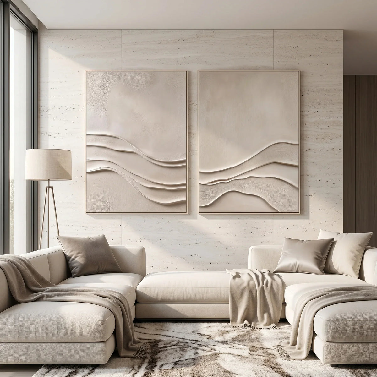
- Sofas: artwork covering 60–75% of width
- Entryways: vertical compositions for spatial lift
Pantone colors work best when they are part of a dominant visual anchor, not a small decorative object.
6. Pair Pantone Colors With Material-Based Interiors
Modern interiors rely heavily on material contrast.
Effective combinations:
- Pantone tones + oak wood textures
- Muted color + matte black metal frames
- Soft tones + linen or stone surfaces
This creates depth without visual noise.
Conclusion
Pantone 2026 Colors of the Year are not meant to be copied directly. Their value lies in interpretation.
Wall art—especially hand-painted abstract oil paintings—offers the most practical way to introduce these colors without compromising long-term design stability.
When applied with restraint, scale awareness, and material coordination, these colors enhance interiors instead of dominating them.