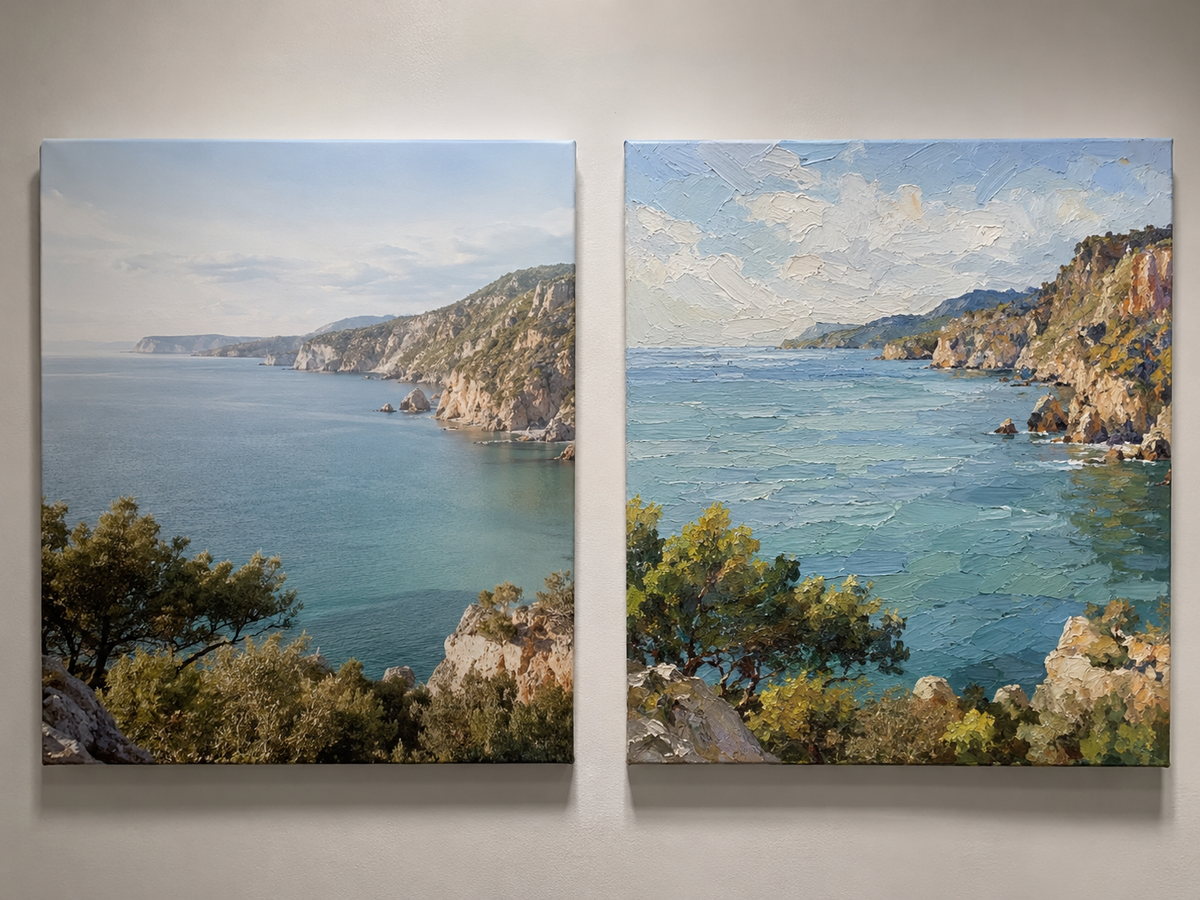
Art for beige and neutral walls should do one of two things: deepen the calm with tonal, textured pieces like wabi-sabi abstracts, or wake the wall up with one confident contrast color — charcoal, ink blue, or deep green. The mistake is choosing art as beige as the wall behind it.
People apologize to me for their beige walls all the time, as if warm neutral were a personality flaw. It's the opposite. A neutral wall is the single most forgiving backdrop in decorating — nearly anything hangs well on it. The only real question is which direction you want the room to go: quieter, or bolder.
Should art match beige walls or contrast with them?
Decide what the room is for. Bedrooms and reading corners usually want tone-on-tone: cream, sand, taupe, and soft white artworks that sit a half-step away from the wall color. Living and dining rooms can take contrast: one strong piece with real darks or saturated color becomes the room's anchor. Both approaches work. Splitting the difference — timid art with a little polite color — is what makes a room feel like a waiting area.
What styles work best on warm neutrals?
Tone-on-tone only works if the painting has texture. When color contrast is low, surface contrast has to do the talking — ridges, scratches, and plaster-like strokes that shift with the daylight. This is why wabi-sabi abstracts are the classic answer for beige rooms: they're built from the same quiet palette but carry enough physical depth to hold a wall alone. It's also why texture is the defining wall-art trend of 2026 — after years of flat AI-generated images flooding every feed, people crave surfaces that are unmistakably made by hand.
Here's a beige wabi-sabi canvas taking shape in our studio — watch how the scratch lines give a "beige" painting its entire character:
Every piece in our wabi-sabi collection is worked by hand like this — 100% painted, signed, frame included.
What colors pop against beige?
Beige is warm, so cool colors create the cleanest contrast: ink blue, silver-grey, deep teal. Charcoal and black feel architectural and pair beautifully with wood furniture. Muted olive and forest green read as natural rather than loud. And if you want warmth-on-warmth, rust and terracotta work — just make sure the painting runs several shades deeper than the wall. We keep a wide bench of options in our abstract collection, and if a piece is right except for the palette, we adjust colors free of charge before painting yours.
How big should art be on a neutral wall?
Bigger than you think. Neutral walls visually enlarge a room, which shrinks small art. Aim for two-thirds the width of the furniture below the piece, or go for a pair — sets of two stretch beautifully across wide beige walls without the commitment of one massive canvas. For the full sizing math, our sofa sizing guide breaks it down with measurements.
FAQ
Does grey art work with beige walls? Yes — pick a warm grey (greige) for harmony or a cool silver-grey for contrast. Avoid flat mid-grey with no texture; it goes lifeless on beige.
One big piece or a gallery wall? On beige, one large textured piece usually wins. Neutral walls flatter simplicity; busy gallery walls can undo the calm you paid for.
Should the frame be light or dark? Dark frames sharpen contrast pieces; natural wood or off-white frames suit tone-on-tone. Our paintings ship with the frame included, matched to the piece.
What if I repaint my walls later? Textured neutrals and blue-toned abstracts survive nearly any repaint. That's the quiet advantage of buying quality once — and with a 30-day return window and photo approval before shipping, you can test it risk-free.