What Wall Art Goes With a White or Cream Sofa? A Painter's Pairing Guide
A white or cream sofa works with almost any artwork, so the right move is to pick art with strong contrast or strong texture — otherwise the whole corner of the room goes soft and reads as unfinished. That's the trap. Buyers with a gray sofa or a navy one have a constraint to push against. You don't, and having no constraint is harder.
Here's how we'd approach it from the studio side.
First, decide which white you actually own
Sofas sold as "white" fall into three camps, and they behave differently on the wall behind them.
True white or bright optic white — cool, slightly blue, common in modern and Scandinavian pieces. It makes warm art look warmer than it did in the photo. Beware of ivory paintings against it; they'll look dirty by comparison.
Cream or ivory — yellow undertone, the most common in the bouclé and linen upholstery everyone bought over the last few years. It reads warm, which means cool blues and grays above it can feel disconnected unless something bridges them.
Greige or oatmeal — sold as white, technically neither. It's forgiving and works with nearly everything, though it can flatten pale art into invisibility.
Hold a sheet of printer paper against your cushion. If the paper looks blue, your sofa is warm. If the sofa looks blue, it's cool. Thirty seconds, and it changes what you should order.
Four pairings that reliably work
- High-contrast black and white. Graphic, architectural, and the safest bet in a modern room. A black-and-white piece gives the sofa an anchor without adding a color you'd have to commit to elsewhere.
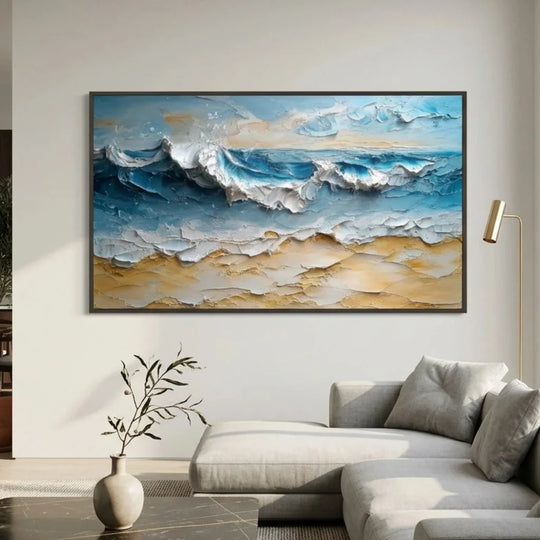
- Warm neutrals with heavy texture. Cream, sand, and clay in raised relief. This is the tone-on-tone approach, and it only works if the texture is real — depth is doing all the work that color usually does.
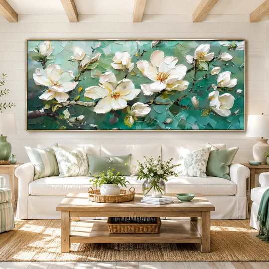
- Deep blue or teal. Cool, saturated, and instantly resolves a room that felt washed out. Especially good over a bright white sofa, where the contrast is clean rather than muddy.
- Terracotta, rust, and ochre. Warm earth tones sitting on cream is one of the most comfortable combinations there is, and it stops the room from feeling like a showroom.
What I'd avoid: pale pastels. On a white sofa they disappear from six feet away. Save them for a room with a colored wall.
Why texture matters more here than anywhere else
A white sofa is a big, smooth, low-information object. If the art above it is also smooth and low-information, that whole wall stops giving your eye anything to do. Raised paint fixes this without adding a single new color — the relief casts real shadows that shift through the day as the light moves, so a cream textured piece over a cream sofa stays interesting in a way a flat cream print never will.
This is also the current direction of the market, not just a studio preference. The global wall art market was near $67 billion in 2025 and is projected to reach roughly $119 billion by 2032, and the growth is concentrated in hand-worked, physically textured pieces — largely as a reaction to the flood of AI-generated flat imagery since 2024. People want the object to show that a hand was involved. Our 3D textured collection is built around exactly that, and the quieter, more imperfect end of it lives in the wabi-sabi collection.
What about the wall color behind it?
Most white sofas sit in front of white or off-white walls, which means your painting is the only source of contrast in a three-object stack — wall, art, sofa. Push harder than you think you need to. In a room where everything else is pale, a piece that felt too bold in the product photo will land as merely confident on the wall.
If your walls are a warmer neutral, we went deeper on that combination in this guide to beige and neutral walls.
Size, quickly
Two-thirds to three-quarters of the sofa's width, bottom edge 6–8 inches above the back cushions. A white sofa is visually lighter than a dark one, which tempts people into hanging something small. Resist it — the proportion rule doesn't change with upholstery color.
A note on living with white furniture
If the sofa is new and you're nervous about it, put the color on the wall rather than in throw pillows you'll get tired of. Art is the low-commitment way to shift the temperature of a room, and it doesn't get sat on.
Every piece we make is 100% hand-painted and signed, with the frame included. Free size and color customization means if a painting is right except for its palette, we'll adjust it — which is genuinely useful when you're matching a specific ivory. We photograph your finished piece and send it for approval before it ships; the painting has already been curing 24 hours by then, so nothing is delayed by the extra step. Delivery is free, insured, and takes 4–8 days, with 30 days to return it.
FAQ
Can I hang a white painting above a white sofa?
Yes, but only a heavily textured one. Flat white on white disappears.
Does a black frame work with a white sofa?
It's the most reliable choice — it draws a clean edge and keeps the art from bleeding into a pale wall.
What if my sofa is cream and my rug is gray?
Pick art that contains both temperatures. A warm neutral with charcoal linework does the job.
Should I match the art to my throw pillows?
No. Pillows change every year; the painting shouldn't be hostage to them.
One large piece or a pair?
One large, unless the sofa is over 90 inches wide — then a set of two balances better.
Start with the newest work in the studio, or browse abstracts if you want color without a subject to commit to.